Case Study —
Pioneering Open Banking in Africa
Okra provides a single, unified Open Banking API that enabled developers to interact with, process, and exchange real-time financial information between customers, applications, and banks in Africa.
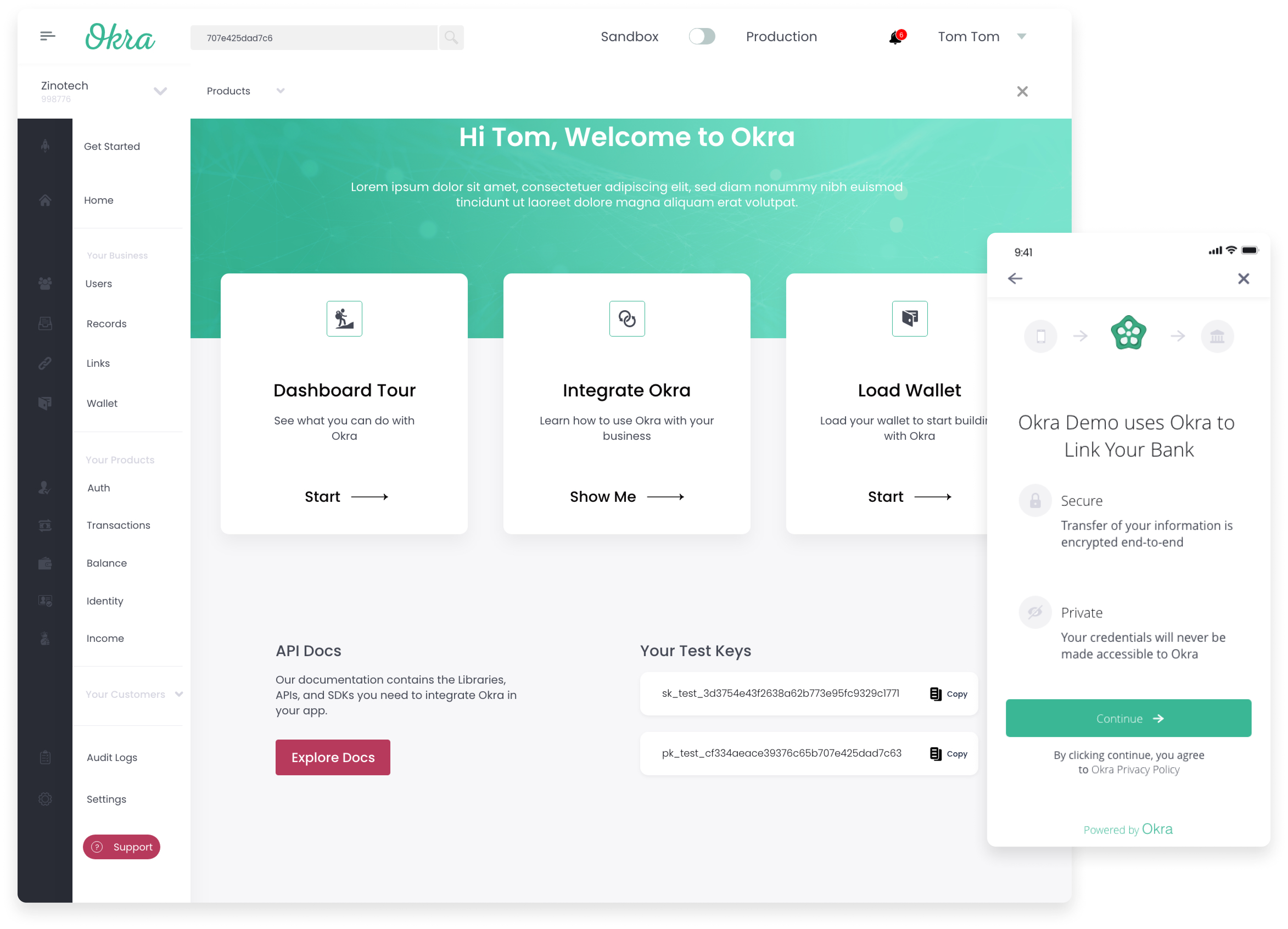
At Okra, I led design efforts to design Link, Okra’s core product that enables individuals to link their bank accounts with 3rd party applications and on the Okra dashboard that enabled leading enterprise technology businesses to manage financial data on behalf of their customers.
What is Okra?
Okra provides a way for consumers to seamlessly link their bank or financial accounts with any application while maintaining total security and control using a secure API.
When a customer links their bank accounts to an application that uses Okra, Okra takes the account logins provided, encrypts the financial data requested such as an account balance & transactions, and then supplies it to the application with a secure connection.
By leveraging Okra, digital lending companies can build products that have higher approval rates and lower loss rates, while simultaneously delivering the exceptional experience their customers demand, personal finance companies can build products that enable their customers make sense of their money.
The Challenge
The first version of the Okra link and developer dashboard “worked” but had its shortcomings and pain points that led to issues for Okra’s clients and their customers
 A high bounce rate.
 Its design wasn’t optimized for usability & accessibility.
 The user experience of the Okra link wasn’t optimized for mobile.
 The Okra link design was not optimized for slow bank response times & slow internet connections.
 As it was a new product with new behavior, it had challenges communicating trust with end-users.
 The Okra dashboard was not optimized for developer integration.
Starting with Data.
The first step was understanding what worked about the current link design and what didn’t work. Working with Okra’s clients, pulling tons of data & watching over 250 recordings from our behavioral analytics tool (Hotjar) helped us to understand our customers and answer questions like these:
What is our current audience like? On what platform do we get the most traffic? What kind of devices do our consumers use? How long does it take to link a bank account? How fast does the Okra link perform? How many pages is the average session?
What did we find?
Most traffic to Okra’s link came in through mobile browsers.
Our audience used low-end android devices with the most common screen size of 360px by 620px.
The average connection session was more than 3 minutes.
The average page session was more than 15 pages. This implied that the connection flow had too many drop-off points and was probably confusing for users.
How might we?
We reframed our data insight statements as “How Might We” questions, we turned those challenges into opportunities for design. We used the “How Might We” format because it suggests that a solution is possible and because they offered us the chance to answer them in a variety of ways.
These core questions formed the foundation for our design explorations on the Okra link & dashboard.

Designing for Trust
Communicating trust & familiarity with the Bank.
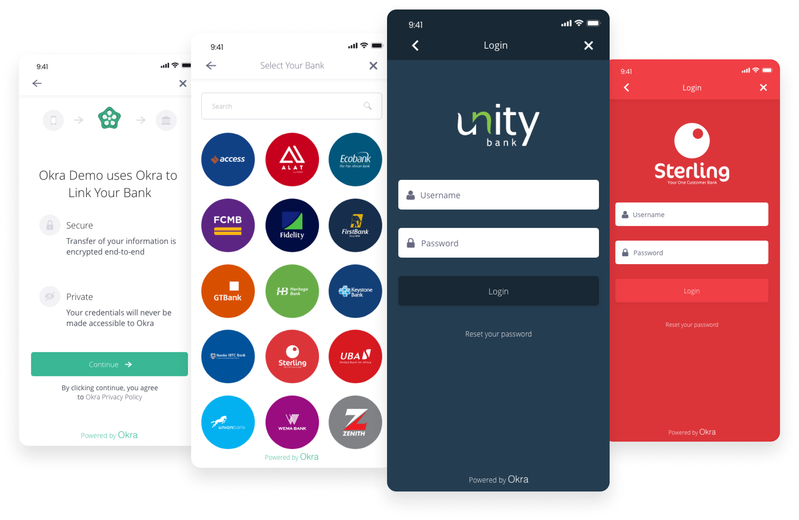
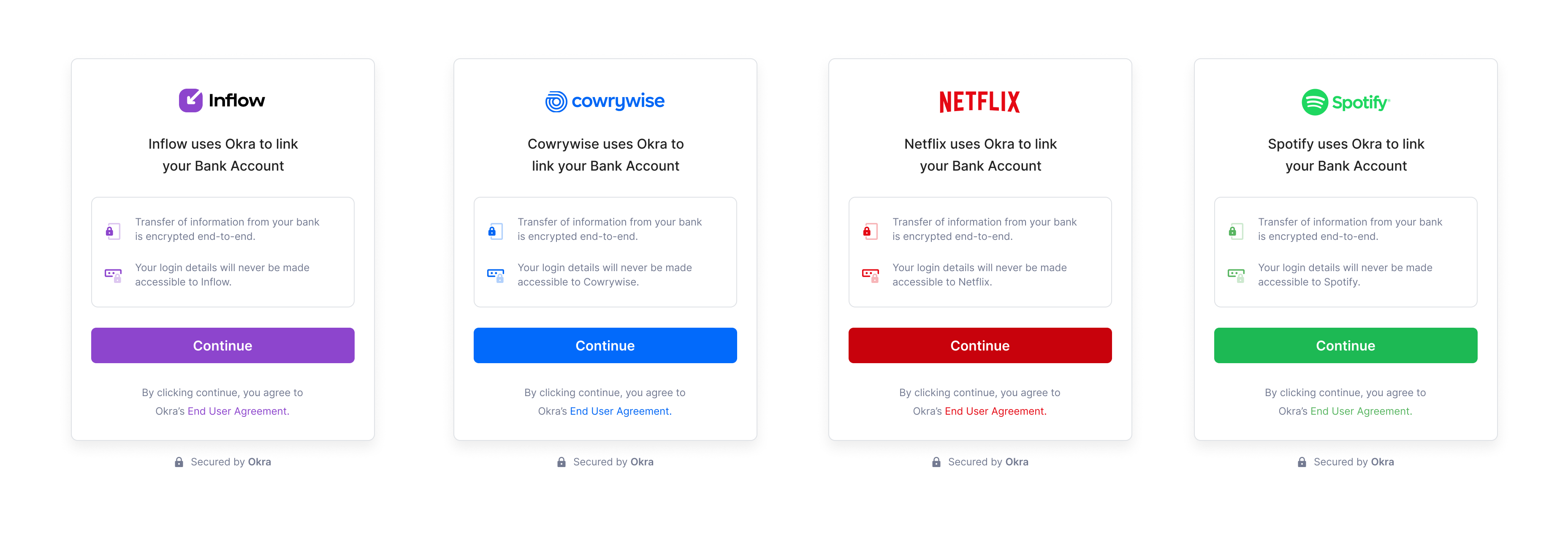
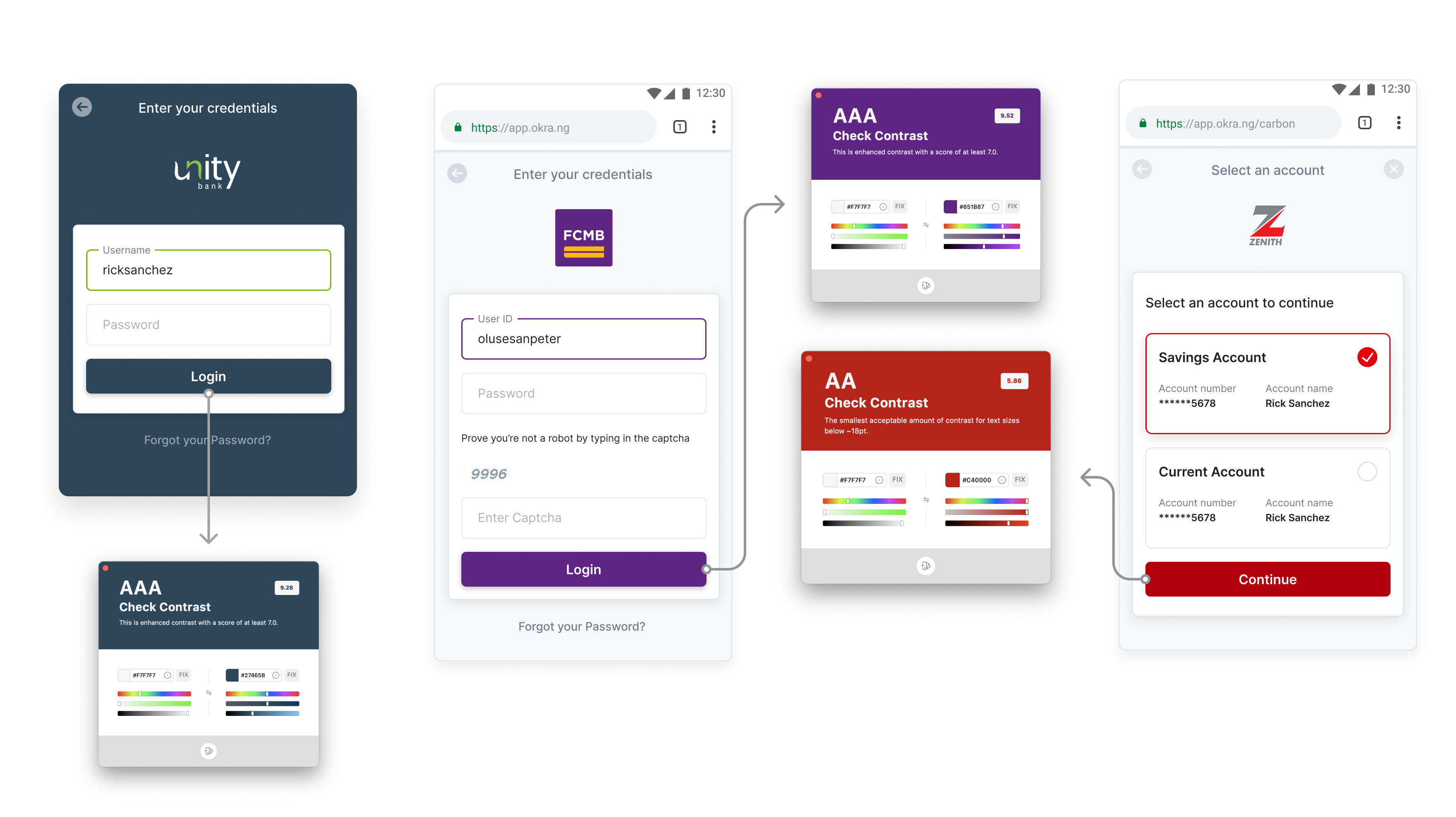
On redesigning the Okra Link, we coupled the brands of financial institutions with that of the Okra link to create a strong sense of trust, familiarity and comfort when users connect their banks to an app.
Every aspect of each financial institution was taken note of, from the colors to even making sure input labels for all Nigerian, Kenyan and South African banks matched exactly what users read when logging into their bank accounts across our Okra links for mobile and web.
Establishing trust with the company.
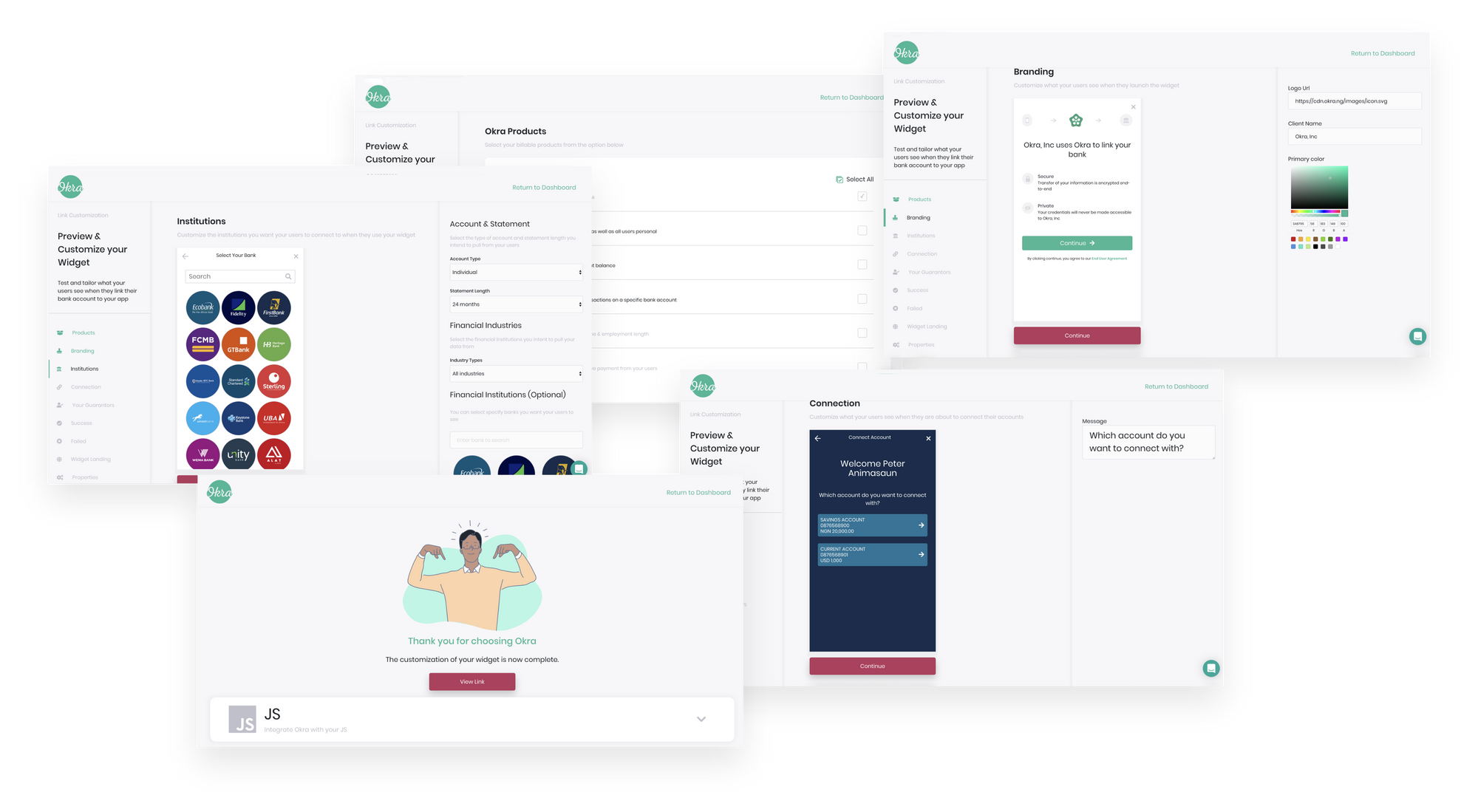
As Okra is most likely going to be used inside the respective apps and platforms of our customers, It was necessary to ensure that there was a level of trust and a way to communicate continuity of whatever the use case of the company was.
We achieved this by enabling companies customize the first point of Interaction with their customers. Companies were able to customize their logos, able to customize text, able to set accent colors for the landing pages of their Okra widget.
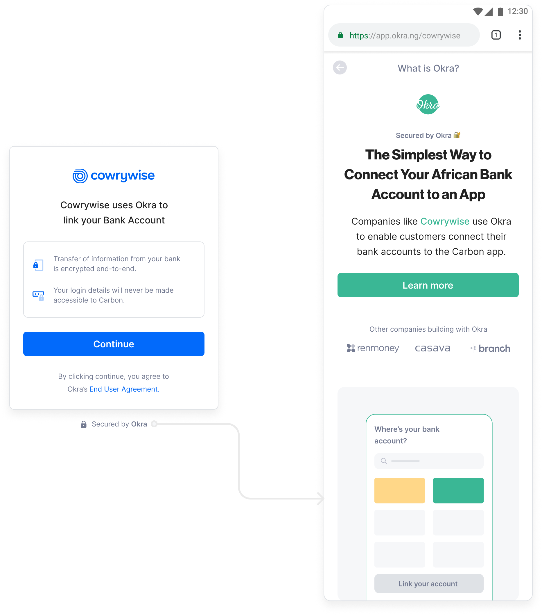
Designing trust & understanding for Okra.
While watching Hotjar recordings & heat maps, we found something quite nifty in Okra’s V1 links. Users always clicked on the “Powered by Okra” tag at the bottom of the page. We later found out this was done by customers curious about the company providing this service.
So we went a step further to explain what Okra does to put customers at ease and in a comfortable place.
Designing for Accessibility
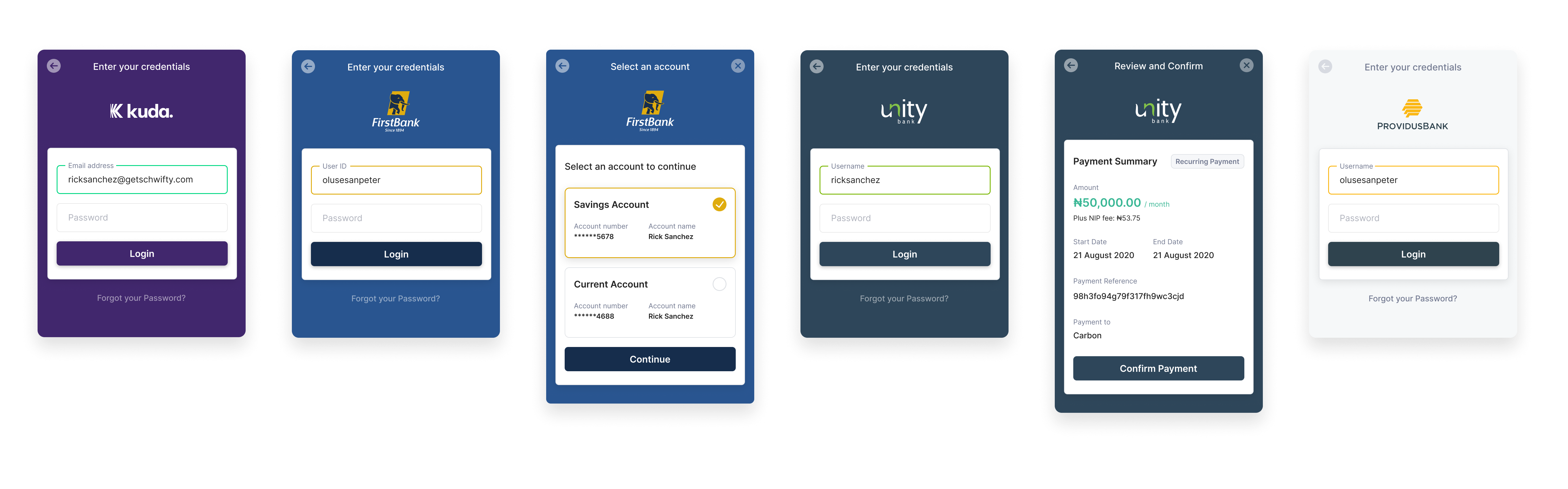
Tuning colors to meet A11Y standards
For the new Okra link, we explored options that allowed for an increase in color contrast for action buttons to provide better visibility to consumers.
As the colors were different from bank to bank, we made sure to select accent and background colors for all banks to provide better visibility to consumers while also meeting a contrast score of at least 5.5 on the Web Content Accessibility Guidelines.
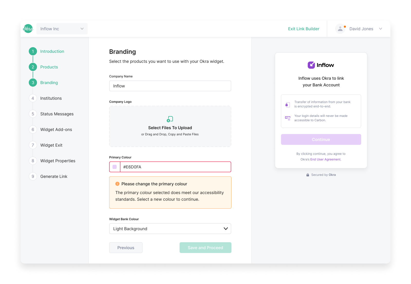
Optimizing link creation for developers
Designing an experience that allowed developers to create new Okra links seamlessly was front and center of our redesign. We redesigned link builder with usability and accessibility for integration developers and customers in mind.
One such example is displaying errors when link creators select branding colors for their respective Okra links that don’t provide enough contrast for customers and don’t meet the web content accessibility guidelines.
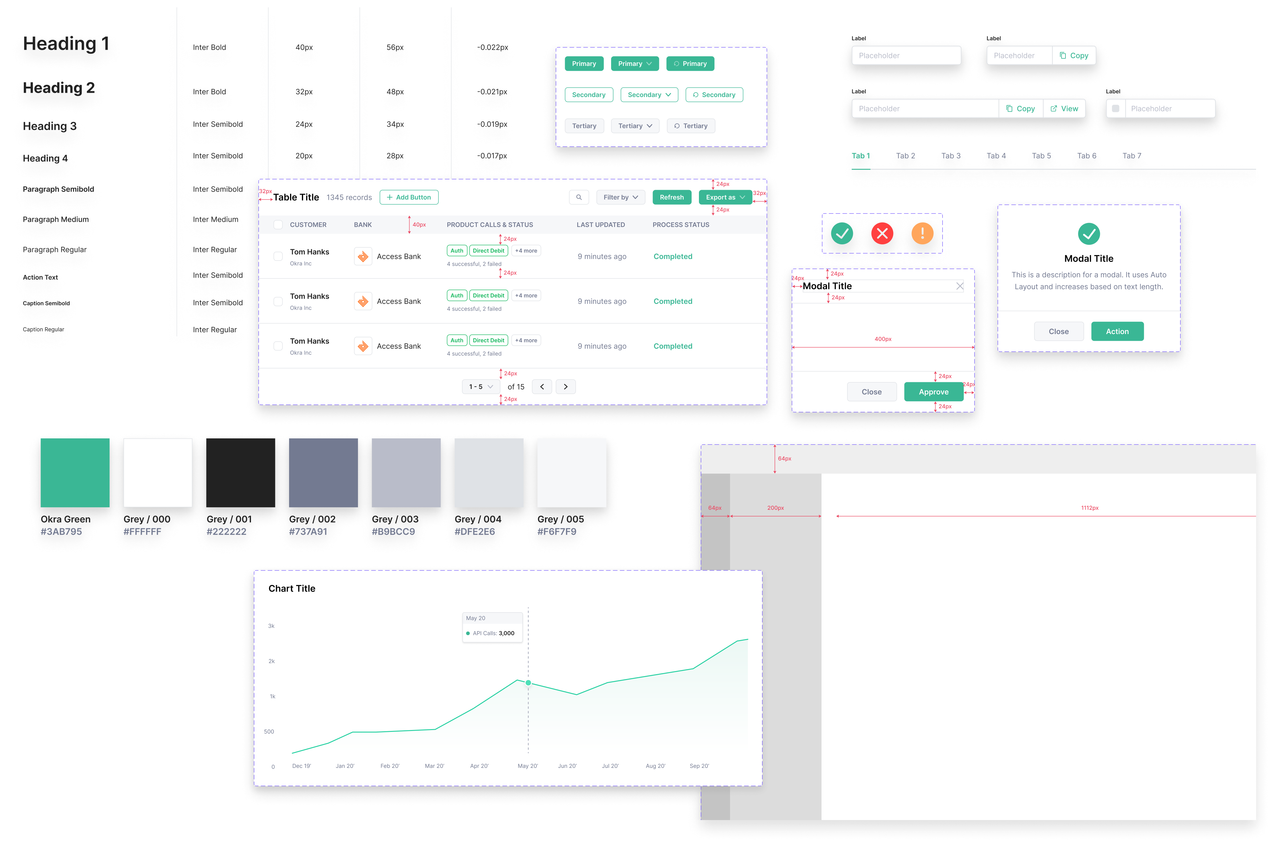
Designing for Scale
Working on a team means having team members with different design styles and preferences and we needed to design the new Okra dashboard and link in record time with a unified experience. To achieve this, we established a component system that defined the interface elements within Okra link and dashboard from scratch.
We carefully considered scalable typography to iconography, table components, charts, and every minute element that contributed to a seamless experience.
Journey so far.
The new Okra link and dashboard are currently in use by lending, banking, insurance & personal finance companies amongst others who have seen significant growth since they migrated to it. It’s performed exceedingly well and has had a positive impact on these companies, their products, and their customers.
For confidentiality reasons, I have omitted the metrics of the impact of this project.