Case Study —
Global payments & building Pax — Paystack's Design System
Paystack is the Stripe-owned payment processor which processes over 50% of online payments in Nigeria. It provides a quick way for governments, cooperates, fintech and small businesses to integrate payment services into an online or offline transaction with a single API.
(A)
Every growing design team eventually faces 3 challenges - How do we work together? How do we get work done? How does our work create impact? I got to work with the Paystack team to figure out how work gets done by leading efforts on their design system by laying a clear foundation for tokens, components, patterns, language and communication based on the atomic design methodology.
[Pax case study is a first draft of an article that was to be published on the Paystack blog a year ago]
(B)
In addition to leading Pax, I got to work with the Global payments & expansion teams to introduce new payment methods for Paystack's merchants in Africa. Notable ones were Apple Pay for Nigeria and SnapScan & Masterpass by Mastercard for South Africa.
Pax — State of the nation.
The task at hand.
Let's imagine for a second that we are all part of a band. We have successfully played in bars and pubs around town and organized the gigs ourselves. We have even played in other cities. We have been so successful that we've started to outgrow our usual gig venues. We can no longer fit all the people who want to listen to our music, and we know that many more people would love our music. This is like music to our ears. Now we can finally realize our dream and become global rock stars.
But wait, we can't organize playing for hundreds of people, negotiate contracts, and hire staff ourselves; we need to focus on making music. We can help for sure, but there are too many pieces to fit together; this requires strong coordination and a whole operation.
Paystack's design team was that band. It had designed and shipped payment products loved and used by millions of Nigerians & Africans. The product stack started growing, which in turn led to new team members. But with scale comes new problems.
How could we design high-quality products without losing a sense of unity across the entire product stack? This is where DesignOps came in.

The Nielsen Norman Group defines refers to DesignOps as the orchestration and optimization of people, processes, and craft in order to amplify design value and impact at scale.
Applying this definition and framework at Paystack and based on our priorities, we focused on fixing how we standardized and harmonized work.
Design & Engineering
At the time, the Paystack design team consisted of about 7 product designers embedded in siloed engineering teams with over 100 developers across the organization.
Right around the same time, Engineering was transitioning the entire product stack from legacy Angular to React, so this seemed like a perfect time for a design systems effort.

The Product Stack
Checkout
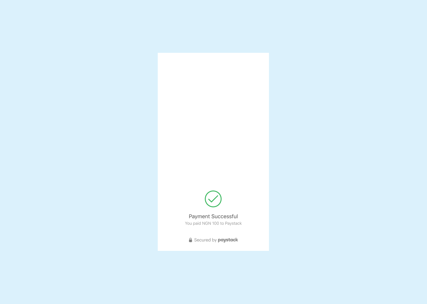
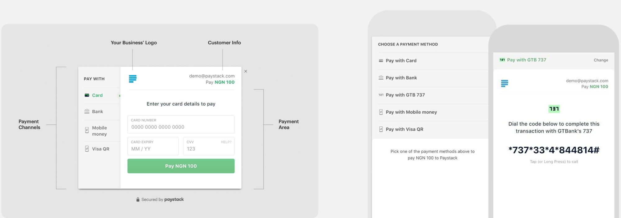
Checkout is a customer-facing application that enables people to pay Paystack's merchant. Its design is currently centered on 3 things - scale, internationalization & communicating trust. More about Checkout here.
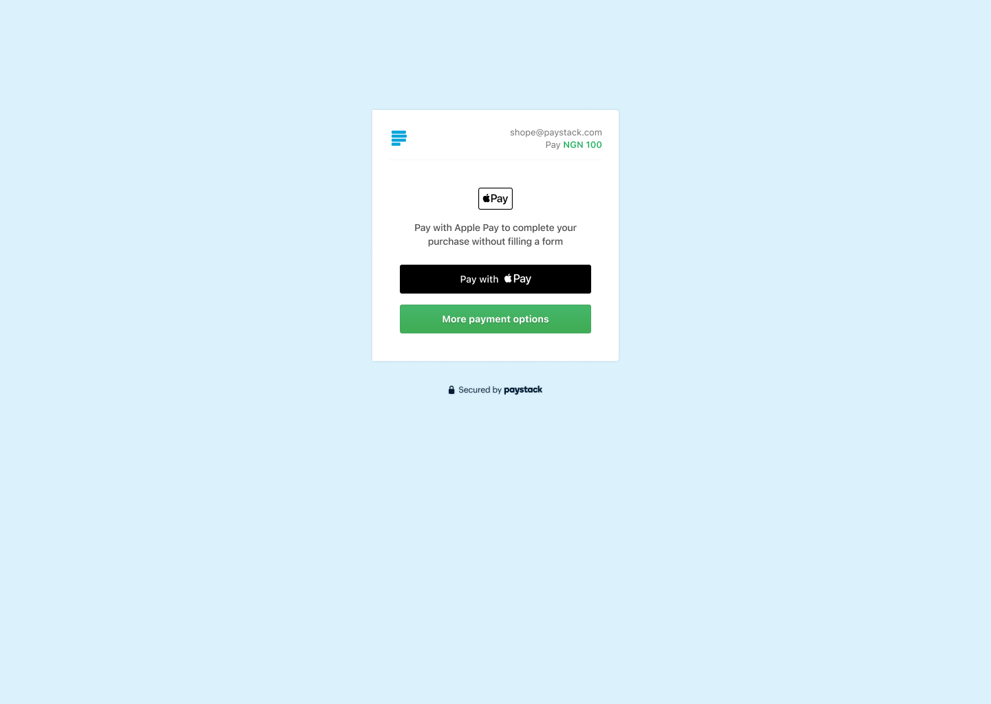
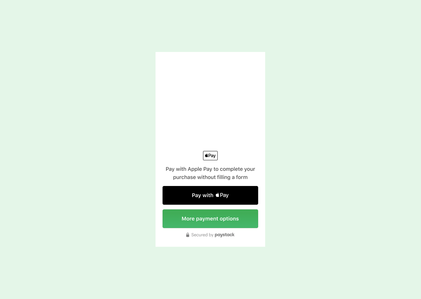
Within Checkout is where you'd find payment channels for customers to make payments. From card payments to bank transfers to Apple Pay. At the time, a barebones component library existed for Checkout and needed to be revisited to hack things together when a new integration needed to be done at Paystack.
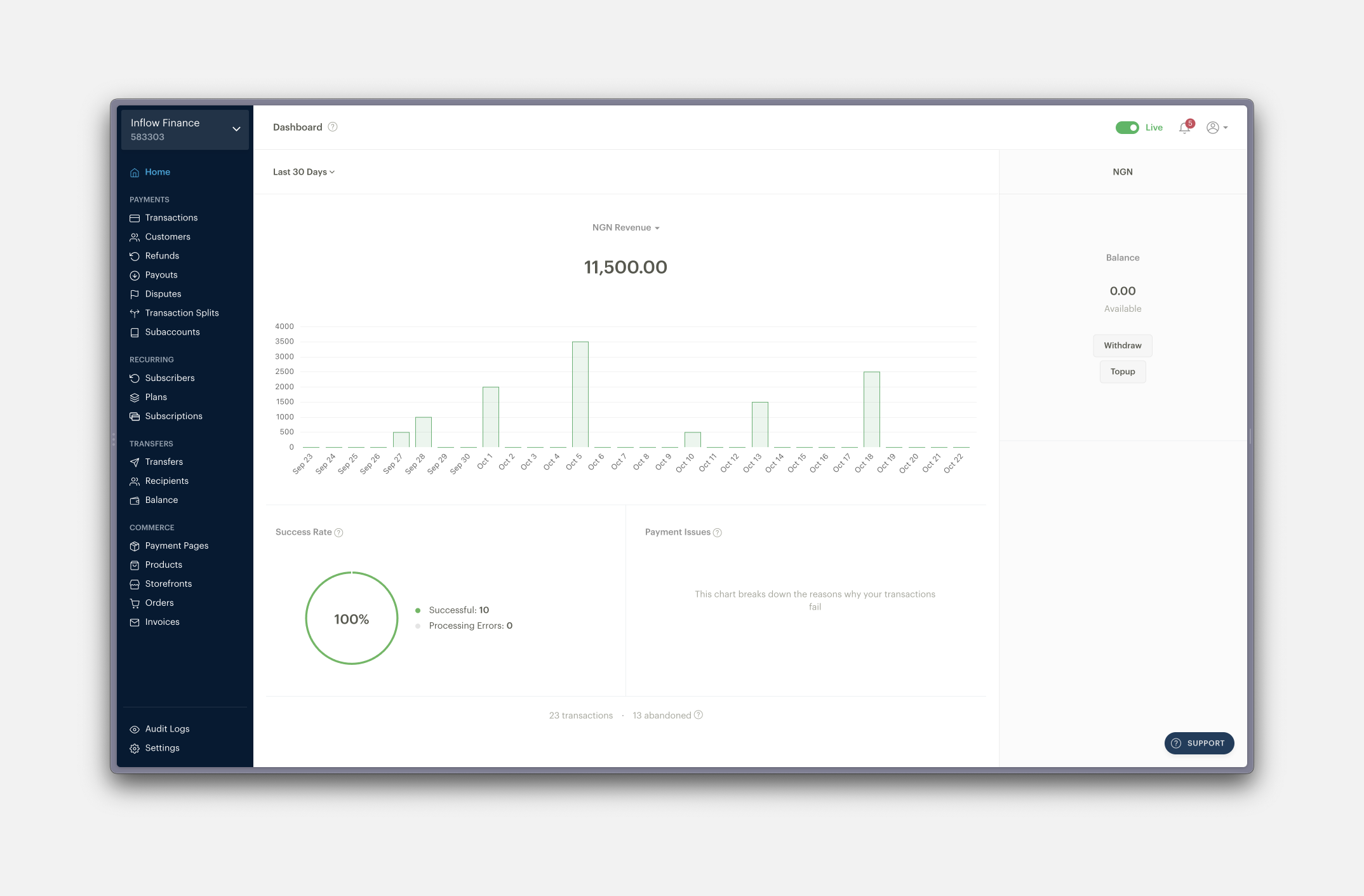
Merchant Dashboards & Watchtower
The Dashboard is the control center for Paystack's over 60,000 merchants. It's where merchants manage payments received, manage customers, handle disputes and manage commerce pages.
The dashboard was the most mature product and had the largest component library, but as with all growing companies and design teams, these components and patterns began to diverge due to a lack of centralised documentation of each component, how they worked, where and how to utilise them.
Paystack's Internal tool codenamed "Watchtower" (Named after the Justice League headquarters) was the command center for 1st line operations for several teams at Paystack from Payment Operations to Dispute management and support teams.
It had its own barebones component library usually hacked together by engineering to build back-office operations for new products with or without design input and oversight.
With these 3 products in mind, we set around to figuring out how to build a design system that worked.
Key Objectives
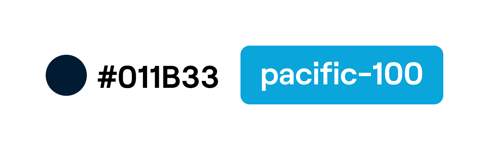
As with all projects, there needs to be a name. Without a name, it's not real. Introducing Pacific - shortened as Pax. It came from Paystack's primary color - #011b33, internally called Pacific blue.
After this naming, we were able to set 3 key objectives for the 1st phase of building out Pax.

Token Architecture
If we were to think of Pax as the common language for designers at Paystack, the design tokens were the adjectives and adverbs. Adobe defines it as design decisions, represented as data, that ensure systematically unified and cohesive product experiences. A mouthful.
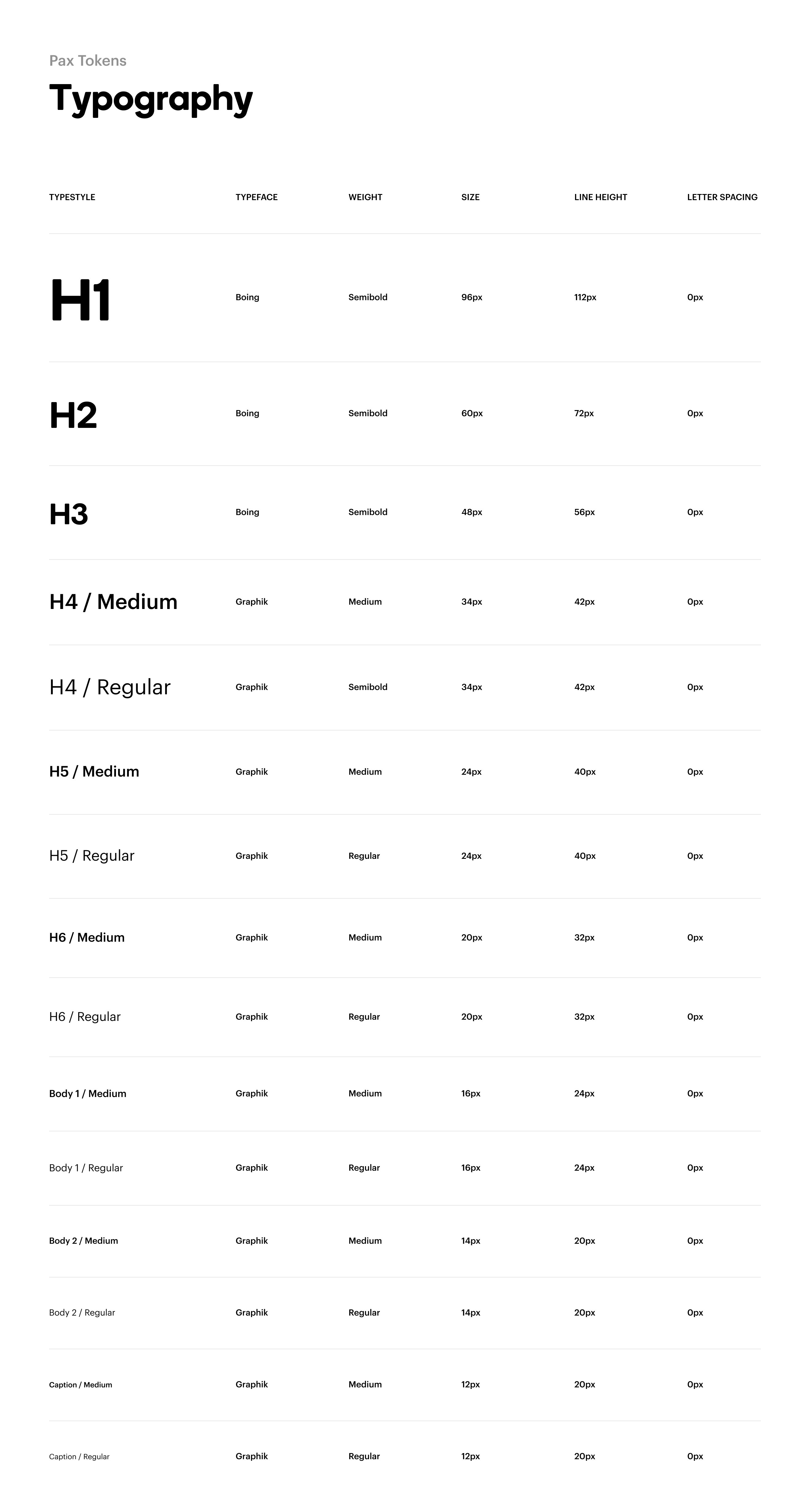
Cross-product Typopgraphy Tokens
Paystack's product stack made things interesting due to how products were built.
The Dashboard was usually carefully crafted with the right typeface (Graphik), the right font sizes, and the right type scale. Watchtower on the other hand was optimized for speed, using default system fonts, a fairly defined type scale, and font sizes - A purely functional system.
And we wanted to keep it that way. Having one type scale with 2 different typefaces. That was the plan. But we couldn't :(
Figma's limitations make it very difficult (and messy) to use two typefaces on a set of Text styles.
We started out creating a type scale set on an 8px grid, but in use, we found it needed to be adjusted, tweaked, and finessed to work for both the Merchant Dashboards and Watchtower.
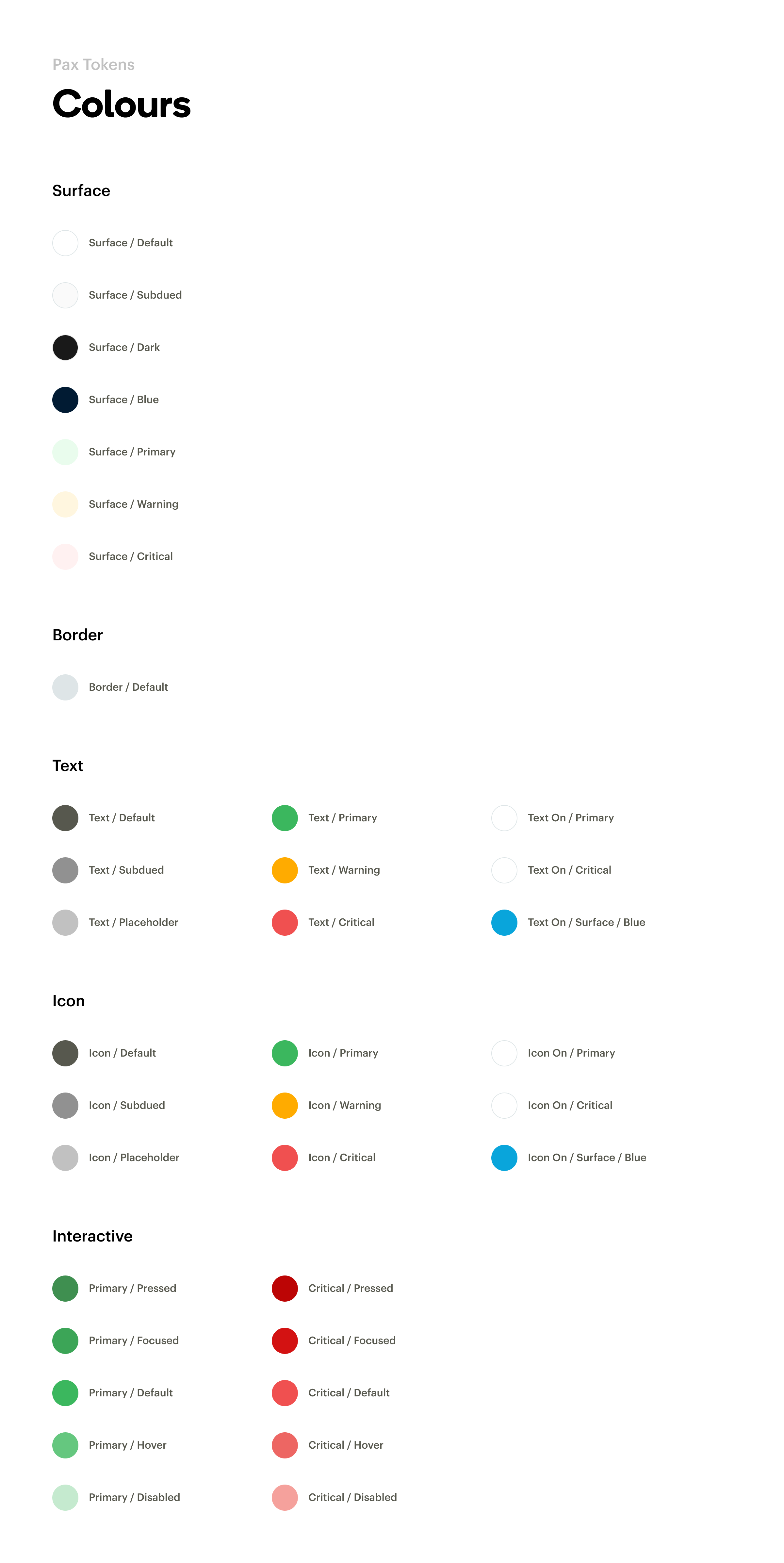
Alias or Component specific Colour Tokens?
There are largely 3 ways to define color tokens - As Global tokens, As Alias tokens, or as Component specific tokens.
The best way to understand how they work is with an example. Let's use pacific (#011b33) in context. It's usually used for typography within the merchant dashboard and in Watchtower.
As a Global token,
Global tokens usually have context-agnostic names and are the least tied to logic or used as a shared language in the design system. The challenge with adopting them is they're usually difficult to reference and not people-friendly.
When designing a language, people should be able to speak and talk about them with as little ambiguity as possible, imagine having to describe the differences between pacific-200 and pacific-800 in real-life conversation with a fellow designer. That'd be a nightmare. So global tokens were out of the race.
As an Alias token,
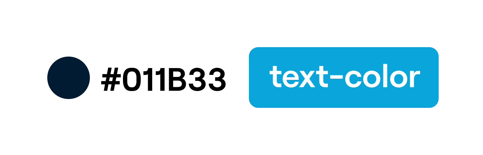
Alias tokens are effective when a value with a single intent will appear in multiple places. In our case, pacific would definitely appear as a text color in multiple places, its people-friendliness also made it one to easily adopt.
As a Component-specific token,
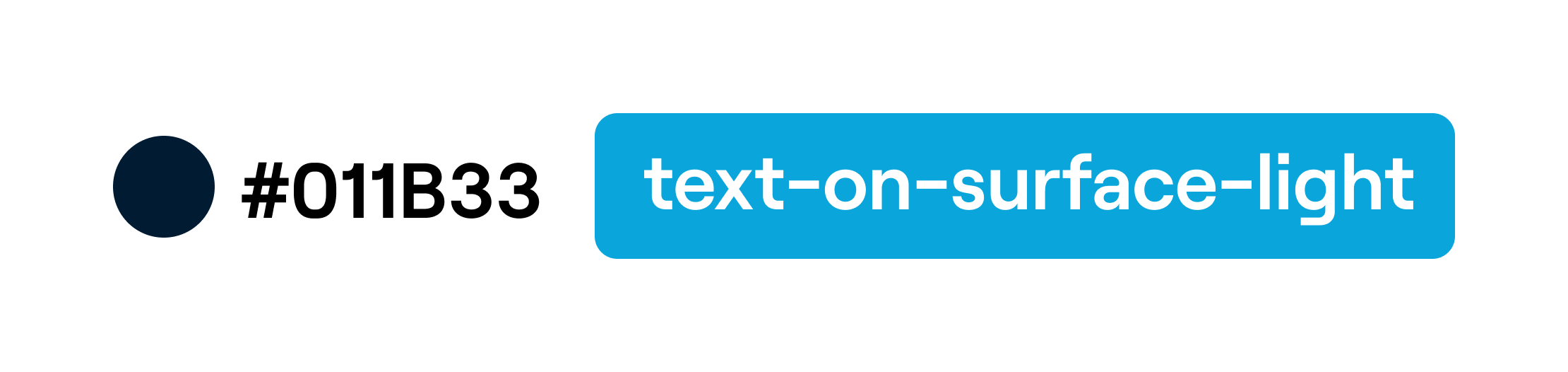
Component-specific tokens allow us to be as specific as possible when naming. They take away all forms of ambiguity. In this case, it's impossible to miss the fact that pacific can only be used as the text color on a light surface (What we called backgrounds). Their only disadvantage is that they don't scale in some cases which can lead to a bloated system.
With all these in mind, I proposed the team use a mix of alias tokens and component-specific tokens for our colors.
Component Architecture
On Atomic Design
Which component do we start with? The one the team needs the most? Should we standardize the button with 5 shades of blue or start with the myriad tables that exist everywhere in the product?
Enter Atomic Design.
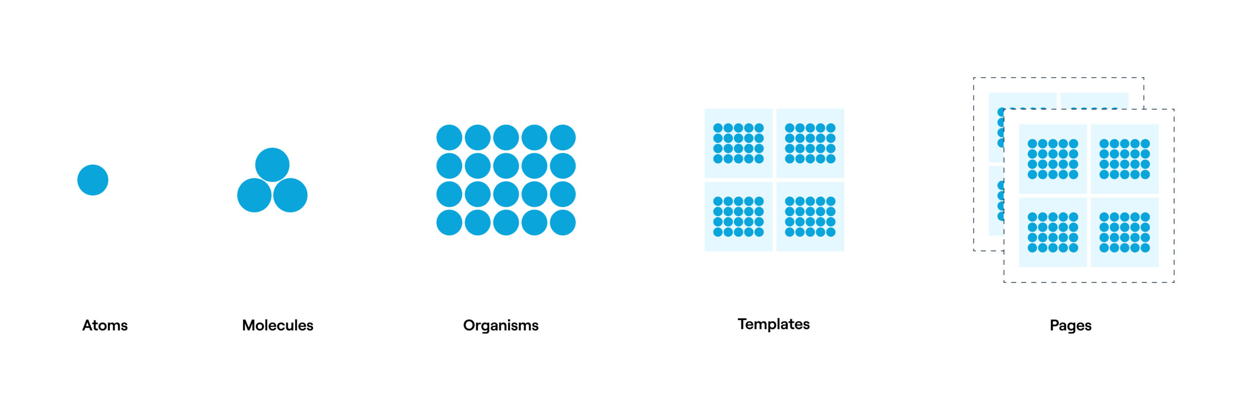
It's based on the pricinple that interfaces are made up of smaller components. This means we can break entire interfaces down into fundamental building blocks and work up from there. In this case, atoms make up molecules, which make up organisms, we can then organise those organisms into templates and pages to be re-used. Kind of like chemistry. That’s the basic gist.
How it works.
Atoms are the basic building blocks of matter. Applied to product interfaces, atoms our checkboxes, radios or the classic button.
Molecules are groups of atoms bonded together and are the smallest fundamental units of a compound. For example, a form label, input or button aren’t too useful by themselves, but combine them together as a form and now they can actually do something together.
Organisms are groups of molecules joined together to form a relatively complex, distinct section of an interface. For example, take a couple of inputs and buttons and you'd get a filter.
Just with atoms, molecules and organisms, we're able to create standalone, portable, reusable components.
Templates and pages allow us to combine organisms to create extensive layouts of our products.
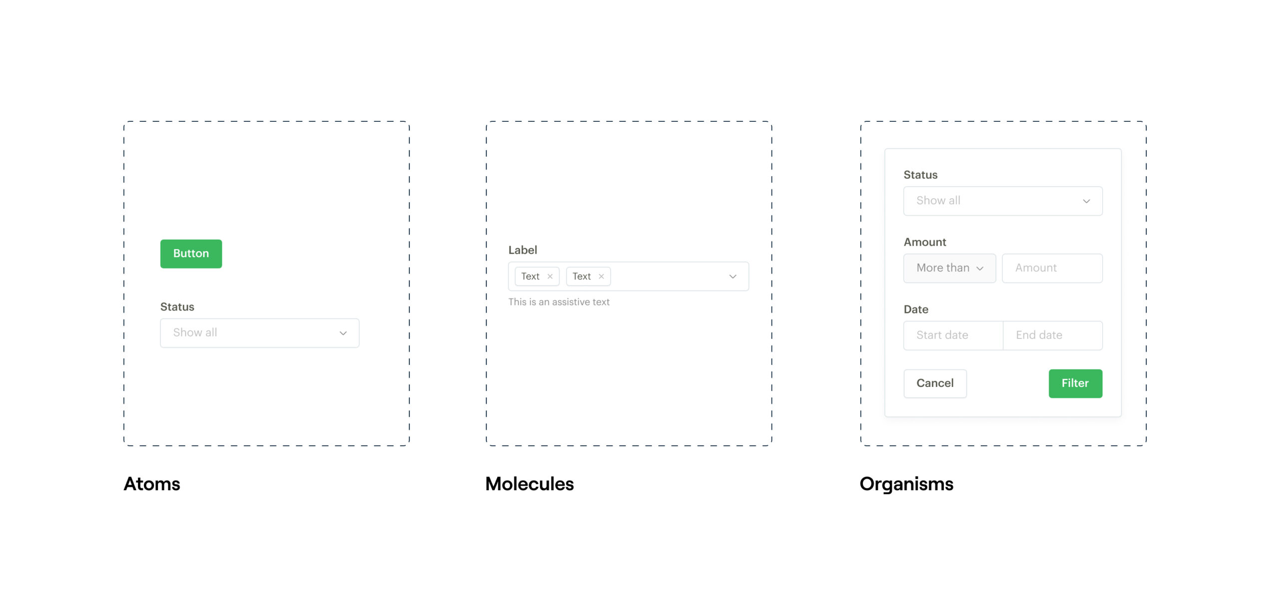
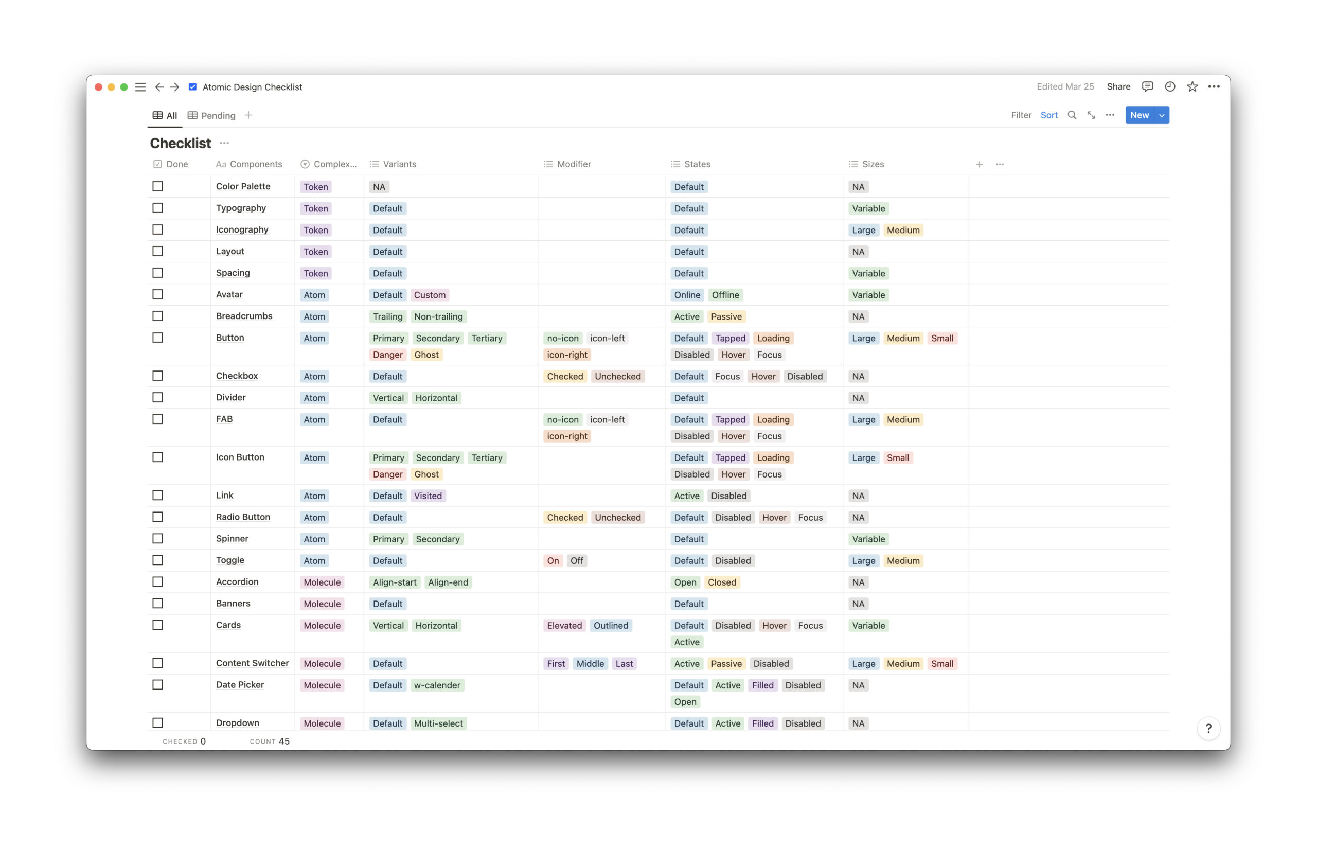
As with all things, it made sense to plan what atoms, molecules, organisms, templates and pages worked for Pax. There's no one-size fits all. We adapted, tweaked and made updates to a checklist made by @saura3h for Pax till we had something working.
Documenting, Maintaining, Governing & Learning from Pax
How did we document Pax with Storybook & Zeroheight, what did the maintenance & Governance model look like? What painful mistakes did we make and which lessons did we learn?
Send me an email, I'd love to tell you all about it - hey@sesan.studio
Global Payments & Expansion
Apple Pay, SnapScan, MasterPass
In addition to working on design systems, I got to work with Global Payments & Expansion teams to integrate new Payment channels for its merchants and customers across West & South Africa.
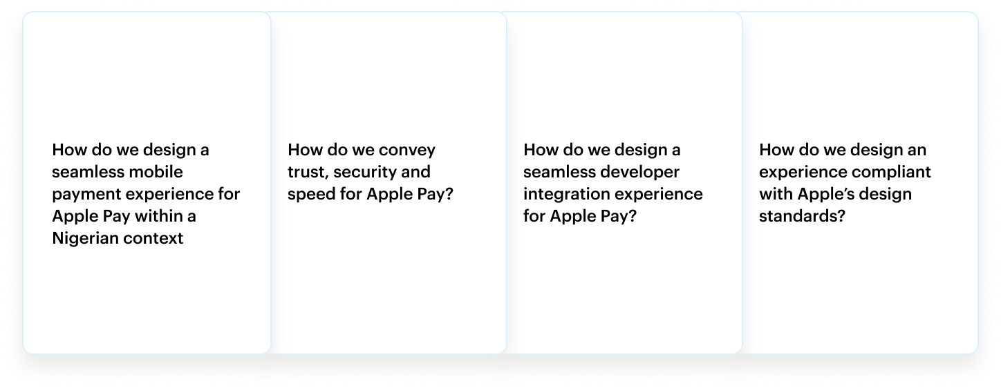
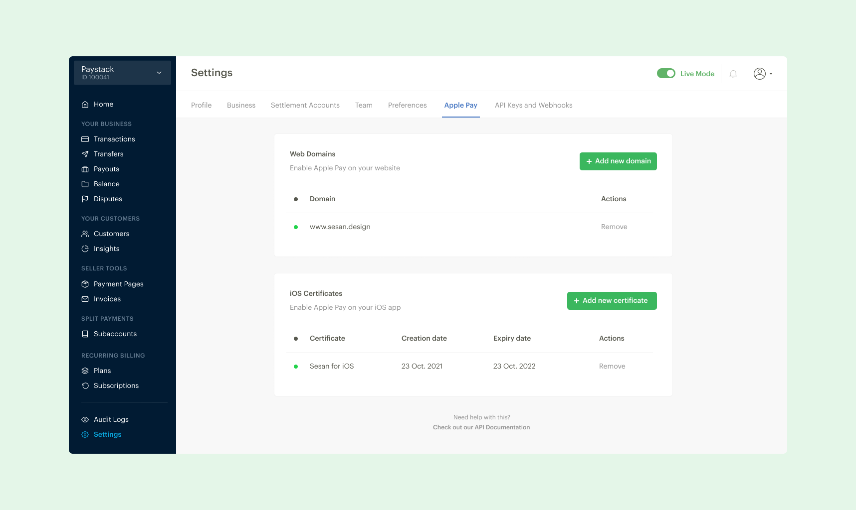
Apple Pay is a mobile payment and digital wallet service by Apple. It enables frictionless payments that allow customers to authorise payments with Touch ID or Face ID, instead of manually filling long payment forms.
Businesses have long been able to accept international card payments with Paystack, but this integration allows Nigerian businesses to access millions of Apple Pay users in the 60+ countries where Apple Pay is supported, including the USA, UK, and Canada. In Nigeria, Paystack is the first payment gateway to support Apple Pay.
I took over the design direction for integrating Apple Pay within the Paystack payment experience. I worked in collaboration with engineers, and a product manager to ship a user centered, usable and accessible payment experience.